What Is Visual Testing?
Learn what visual testing is, why visual testing is important, the differences between visual and functional testing and how you can get started with automated visual testing today.
Foundations
Frameworks
What is Meant By Visual Testing?
Visual testing evaluates the visible output of an application and compares that output against the results expected by design. In other words, it helps catch “visual bugs” in the appearance of a page or screen, which are distinct from strictly functional bugs.
You can run visual tests at any time on any application with a visual user interface. Most developers run visual tests on individual components during development, and on a functioning application during end-to-end tests.
In today’s world, in the world of HTML, web developers create pages that appear on a mix of browsers and operating systems. Because HTML and CSS are standards, frontend developers want to feel comfortable with a ‘write once, run anywhere’ approach to their software. Which also translates to “Let QA sort out the implementation issues.” QA is still stuck checking each possible output combination for visual bugs.
This explains why, when I worked in product management, QA engineers would ask me all the time, “Which platforms are most important to test against?” If you’re like most QA team members, your test matrix has probably exploded: multiple browsers, multiple operating systems, multiple screen sizes, multiple fonts — and dynamic responsive content that renders differently on each combination.
If you are with me so far, you’re starting to answer the question: why do visual testing?
Why is Visual Testing Important?
We do visual testing because visual errors happen — more frequently than you might realize. Take a look at this visual bug on Instagram’s app:
This @LinkedIn post by @techgirl1908 has struck a nerve…take a look! https://t.co/uwt29BY2Zh#GUIGoneWrong
— Applitools (@Applitools) March 28, 2019
The text and ad are crammed together. If this was your ad, do you think there would be a revenue impact? Absolutely.
Visual bugs happen at other companies too: Amazon. Google. Slack. Robin Hood. Poshmark. Airbnb. Yelp. Target. Southwest. United. Virgin Atlantic. OpenTable. These aren’t cosmetic issues. In each case, visual bugs are blocking revenue.
If you need to justify spending money on visual testing, share these examples with your boss.
All these companies are able to hire some of the smartest engineers in the world. If it happens to Google, or Instagram, or Amazon, it probably can happen to you, too.
Why do these visual bugs occur? Don’t they do functional testing? They do — but it’s not enough.
Visual bugs are rendering issues. And rendering validation is not what functional testing tools are designed to catch. Functional testing measures functional behavior.
Why can’t functional test cover visual issues?
Sure, functional test scripts can validate the size, position, and color scheme of visual elements. But if you do this, your test scripts will soon balloon in size due to checkpoint bloat.
To see what I mean, let’s look at an Instagram ad screen that’s properly rendered. There are 21 visual elements by my count — various icons, text. (This ignores iOS elements at the top like WiFi signal and time, since those aren’t controlled by the Instagram app.)

If you used traditional checkpoints in a functional testing tool like Selenium Webdriver, Cypress, WebdriverIO, or Appium, you’d have to check the following for each of those 21 visual elements:
- Visible (true/false)
- Upper-left x,y coordinates
- Height
- Width
- Background color
That means you’d need the following number of assertions:
21 visual elements x 5 assertions per element = 105 lines of assertion code
Even with all this assertion code, you wouldn’t be able to detect all visual bugs. Such as whether a visual element can’t be accessed because it’s being covered up, which blocked revenue in the above examples from Yelp, Southwest, United, and Virgin Atlantic. And, you’d miss subtleties like the brand logo, or the red dot under the heart.
But it gets worse: if OS, browser, screen orientation, screen size, or font size changes, your app’s appearance will change as a result. That means you have to write another 105 lines of functional test assertions. For EACH combination of OS/browser/font size/screen size/screen orientation/font size.
You could end up with thousands of lines of assertion code — any of which might need to change with a new release. Trying to maintain that would be sheer madness. No one has time for that.
You need visual testing because visual errors occur. And you need visual testing because you cannot rely on functional tests to catch visual errors.
What is Manual Visual Testing?
Because automated functional testing tools are poorly suited for finding visual bugs, companies find visual glitches using manual testers. Lots of them (more on that in a bit).
For these manual testers, visual testing behaves a lot like this spot-the-difference game:

To understand how time-consuming visual testing can be, get out your phone and time how long it takes for you to find all six visual differences. I took a minute to realize that the writing in the panels doesn’t count. It took me about 3 minutes to spot all six. Or, you can cheat and look at the answers.
Why does it take so long? Some differences are difficult to spot. In other cases, our eyes trick us into finding differences that don’t exist.
Manual visual testing means comparing two screenshots, one from your known good baseline image, and another from the latest version of your app. For each pair of images, you have to invest time to ensure you’ve caught all issues. Especially if the page is long, or has a lot of visual elements. Think “Where’s Waldo”…

Challenges of manual testing
If you’re a manual tester or someone who manages them, you probably know how hard it is to visually test.
If you are a test engineer reading this paragraph, you already know this: web page testing only starts with checking the visual elements and their function on a single operating system, browser, browser orientation, and browser dimension combination. Then continue on to other combinations. And, that’s where a huge amount of test effort lies – not in the functional testing, but in the inspection of visual elements across the combination of an operating system, browser, screen orientation, and browser dimensions.
To put it in perspective, imagine you need to test your app on:
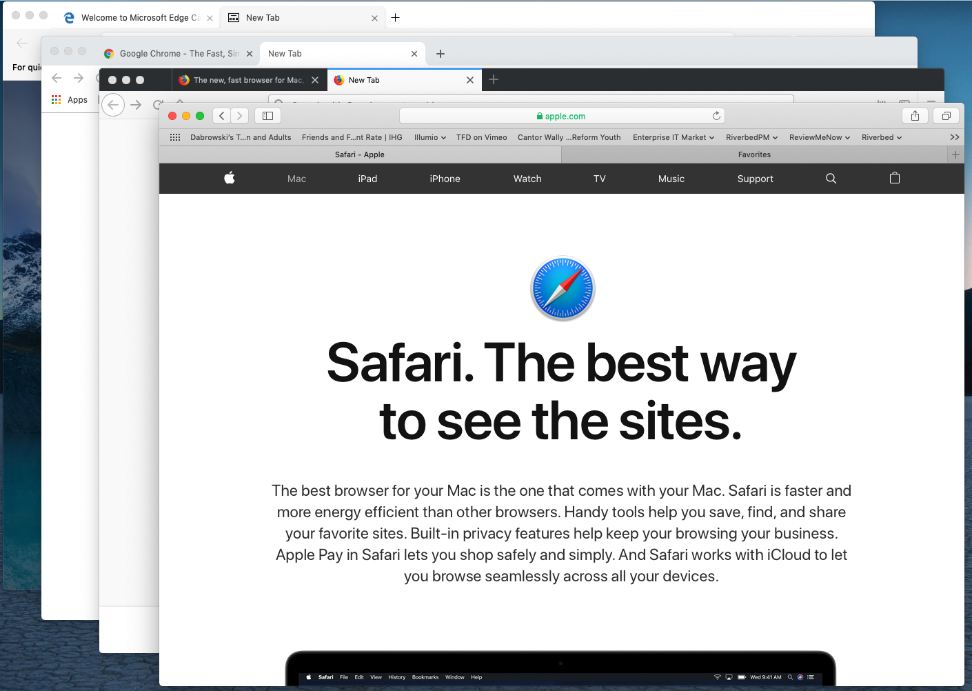
- 5 operating systems: Windows, MacOS, Android, iOS, and Chrome.
- 5 popular browsers: Chrome, Firefox, Internet Explorer (Windows only) Microsoft Edge (Windows Only), and Safari (Mac only).
- 2 screen orientations for mobile devices: portrait and landscape.
- 10 standard mobile device display resolutions and 18 standard desktop/laptop display resolutions from XGA to 4G.
If you’re doing the math, you think it’s the browsers running on each platform (a total of 21 combinations) multiplied by the two orientations of the ten mobiles (2×10)=20 added to the 18 desktop display resolutions.
21 x (20+18) = 21 x 38 = 798 Unique Screen Configurations to test
That’s a lot of testing — for just one web page or screen in your mobile app.
Except that it’s worse. Let’s say your app has 100 pages or screens to test.
798 Screen Configurations x 100 Screens in-app = 79,800 Screen Configurations to test
Meanwhile, companies are releasing new app versions into production as frequently as once a week, or even once a day.
How many manual testers would you need to test 79,800 screen configurations in a week? Or a day? Could you even hire that many people?
Wouldn’t it be great if there was a way to automate this crazy-tedious process?
Well, yes there is…
What is Automated Visual Testing?
Automated visual testing uses software to automate the process of comparing visual elements across various screen combinations to uncover visual defects.
Automated visual testing piggybacks on your existing functional test scripts running in a tool like Selenium Webdriver, Cypress, WebdriverIO, or Appium. As your script drives your app, your app creates web pages with static visual elements. Functional testing changes visual elements, so each step of a functional test creates a new UI state you can visually test.
Automated visual testing evolved from functional testing. Rather than descending into the madness of writing assertions to check the properties of each visual element, automated visual testing tools visually check the visual appearance of an entire screen with just one assertion statement. This leads to test scripts that are MUCH simpler and easier to maintain.
But, if you’re not careful, you can go down an unproductive rat hole. I’m talking about Snapshot Testing.
What is Snapshot Testing?
First generation automated visual testing uses a technology called snapshot testing. With snapshot testing, a bitmap of a screen is captured at various points of a test run and its pixels are compared to a baseline bitmap.
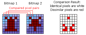
Snapshot testing algorithms are very simplistic: iterate through each pixel pair, then check if the color hex code is the same. If the color codes are different, raise a visual bug.
Because they can be built relatively easily, there are a number of open-source and commercial snapshot testing tools. Unlike human testers, snapshot testing tools can spot pixel differences quickly and consistently. And that’s a step forward. A computer can highlight the visual differences in the Hocus Focus cartoon easily. A number of these tools market themselves as enabling “pixel perfect testing”.
Sounds like a good idea, right?
What are Problems With Snapshot Testing?
Alas, pixels aren’t visual elements. Font smoothing algorithms, image resizing, graphics cards, and even rendering algorithms generate pixel differences. And that’s just static content. The actual content can vary between any two interfaces. As a result, a tool that expects exact pixel matches between two images can be filled with pixel differences.
If you want to see some examples of bitmap differences affecting snapshot testing, take a look at the blog post we wrote on this topic last year.
Unfortunately, while you might think snapshot testing makes intuitive sense, practitioners like you are finding that the conditions for running successful bitmap comparisons require a stationary target, while your company continues to develop dynamic websites across a range of browsers and operating systems. You can try to force your app to behave a certain way – but you may not always succeed.
Can you share some details of Snapshot Testing Problems?
For example, when testing on a single browser and operating system:
- Identify and isolate (mute) fields that change over time, such as radio signal strength, battery state, and blinking cursors.
- Ignore user data that might otherwise change over time, such as visitor count.
- Determine how to support testing content on your site that must change frequently – especially if you are a media company or have an active blog.
- Consider how different hardware or software affects antialiasing.
When doing cross-browser testing, you must also consider:
- Text wrapping, because you cannot guarantee the locations of text wrapping between two browsers using the same specifications. The text can break differently between two browsers, even with identical screen size.
- Image rendering software, which can affect the pixels of font antialiasing as well as images and can vary from browser to browser (and even on a single browser among versions).
- Image rendering hardware, which may render bitmaps differently.
- Variations in browser font size and other elements that affect the text.
If you choose to pursue snapshot testing in spite of these issues, don’t be surprised if you end up joining the group of experienced testers who have tried, and then ultimately abandoned, snapshot testing tools.
Can I See Some Snapshot Testing Problems In Real Life?
Here are some quick examples of these real-life bitmap issues.
If you use pixel testing for mobile apps, you’ll need to deal with the very dynamic data at the top of nearly every screen: network strength, time, battery level, and more:
![]()
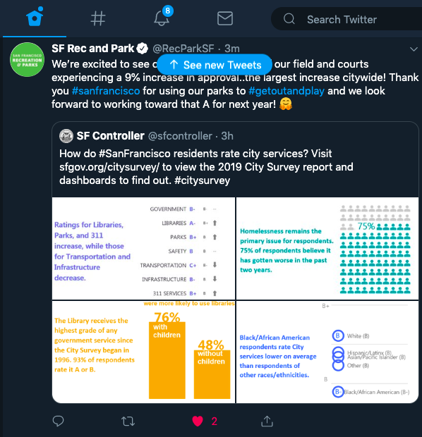
When you have dynamic content that shifts over time — news, ads, user-submitted content — where you want to check to ensure that everything is laid out with proper alignment and no overlaps. Pixel comparison tools can’t test for these cases. Twitter’s user-generated content is even more dynamic, with new tweets, like, retweet, and comment counts changing by the second.
Your app doesn’t even need to change to confuse pixel tools. If your baselines and test screenshots were captured on different machines with different display settings for anti-aliasing, that can turn pretty much the entire page into a false positive, like this:

Source: storybook.js.org
If you’re using pixel tools and you still have to track down false positives and expose false negatives, what does that say about your testing efficiency?
For these reasons, many companies throw out their pixel tools and go back to manual visual testing, with all of its issues.
There’s a better alternative: using AI — specifically computer vision — for visual testing.
How Do I Use AI for Automated Visual Testing?
The current generation of automated visual testing uses a class of artificial intelligence algorithms called computer vision as a core engine for visual comparison. Typically these algorithms are used to identify objects with images, such as with facial recognition. We call them visual AI testing tools.

AI-powered automated visual testing combines a learning algorithm to interpret the relationship between a rendered page and intended display of visual elements with actual visual elements and locations. Like pixel tools, AI-powered automated visual testing takes page snapshots as your functionally tests run. Unlike pixel-based comparators, AI-powered automated visual test tools use algorithms instead of pixels to determine when errors have occurred.
Unlike snapshot testers, AI-powered automated visual testing tools do not need special environments that remain static to ensure accuracy. Testing and real-world customer data show that AI testing tools have a high degree of accuracy even with dynamic content because the comparisons are based on relationships and not simply pixels.
Here’s a comparison of the kinds of issues that AI-powered visual testing tools can handle compared to snapshot testing tools:
| Visual Testing Use Case | Snapshot Testing | Visual AI |
|---|---|---|
| Cross-browser testing | No | Yes |
| Account balances | No | Yes |
| Mobile device status bars | No | Yes |
| News content | No | Yes |
| Ad content | No | Yes |
| User submitted content | No | Yes |
| Suggested content | No | Yes |
| Notification icons | No | Yes |
| Content shifts | No | Yes |
| Mouse hovers | No | Yes |
| Cursors | No | Yes |
| Anti-aliasing settings | No | Yes |
| Browser upgrades | No | Yes |
Some AI-powered test tools have been tested at a false positive rate of 0.001% (or 1 in every 100,000 errors).
AI-Powered Test Tools In Action
An AI-powered automated visual testing tool can test a wide range of visual elements across a range of OS/browser/orientation/resolution combinations. Just running the first baseline of rendering and functional test on a single combination is sufficient to guide an AI-powered tool to test results across the range of potential platforms
Here are some examples of how AI-powered automated visual testing improves visual test results by awareness of content.
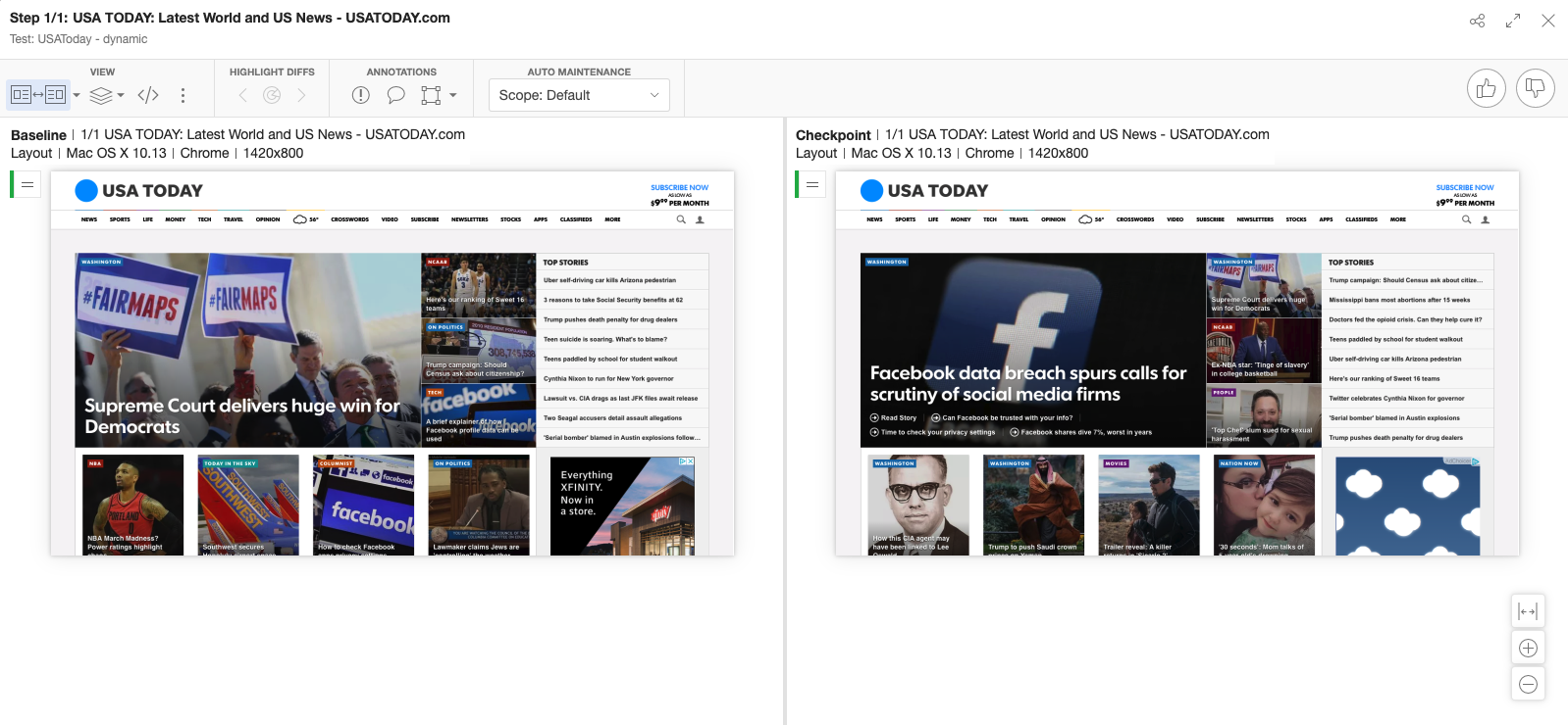
This is a comparison of two different USA Today homepage images. When an AI-powered tool looks at the layout comparison, the layout framework matters, not the content. Layout comparison ignores content differences; instead, layout comparison validates the existence of the content and relative placement. Compare that with a bitmap comparison of the same two pages (also called “exact comparison:):

Literally, every non-white space (and even some of the white space) is called out.
Which do you think would be more useful in your validation of your own content?
When Should I Use Visual Testing?
You can do automated visual testing with each check-in of front-end code, after unit testing and API testing, and before functional testing — ideally as part of your CI/CD pipeline running in Jenkins, Travis, or another continuous integration tool.
How often? On days ending with “y”. 🙂
Because of the accuracy of AI-powered automated visual testing tools, they can be deployed in more than just functional and visual testing pre-production. AI-powered automated visual testing can help developers understand how visual element components will render across various systems. In addition to running in development, test engineers can also validate new code against existing platforms and new platforms against running code.

AI-powered tools like Applitools allow different levels of smart comparison.
AI-powered visual testing tools are a key validation tool for any app or web presence that requires a regular change in content and format. For example, media companies change their content as frequently as twice per hour use AI-powered automated testing to isolate real errors that affect paying customers without impacting. And, AI-powered visual test tools are key tools in the test arsenal for any app or web presence going through brand revision or merger, as the low error rate and high accuracy lets companies identify and fix problems associated with major DOM, CSS and Javascript changes that are core to those updates.
Talk to Applitools
Applitools is the pioneer and leading vendor in AI-powered automated visual testing. Applitools has a range of options to help you become incredibly productive in application testing. We can help you test components in development. We can help you find the root cause of the visual errors you have encountered. And, we can run your tests on an Ultrafast Grid that allows you to recreate your visual test in one environment across a number of others on various browser and OS configurations. Our goal is to help you realize the vision we share with our customers – you need to create functional tests for only one environment and let Applitools run the validation across all your customer environments after your first test has passed. We’d love to talk testing with you – feel free to reach out to contact us anytime.
More To Read About Visual Testing
If you liked reading this, here are some more Applitools posts and webinars for you.
- Visual Testing for Mobile Apps by Angie Jones
- Visual Assertions – Hype or Reality? – by Anand Bagmar
- The Many Uses of Visual Testing by Angie Jones
- Visual UI Testing as an Aid to Functional Testing by Gil Tayar
- Visual Testing: A Guide for Front End Developers by Gil Tayar
- Visual Testing FAQ
Find out more about Applitools. Setup a live demo with us, or if you’re the do-it-yourself type, sign up for a free Applitools account and follow one of our tutorials.


