The Insights Test Analytics tab is set up as a dashboard which displays a set of charts that provide an at-a-glance view of test execution information, test results and test scenarios defined in the product. The Scope for which you can view information is role based, see The Insights page. As such, the charts can be viewed with respect to the Account or with respect to Teams for which you are a member and within a selected Date Range.
For more information see Setting the Scope and Setting the Date Range.
Viewing report charts
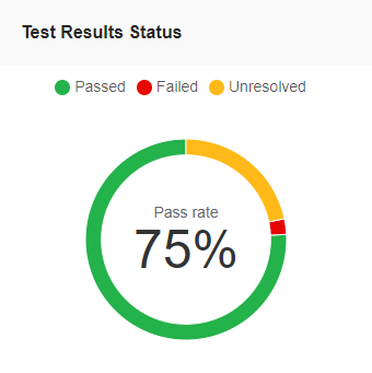
Eyes uses color coding in the report charts to represent the different statuses for tests and batches.

Passed: colored Green
Failed: colored Red
Unresolved : Yellow
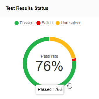
Hovering the mouse pointer over part of a chart displays explanatory information on the data metrics or status for that point of the chart.
Test Analytics reports
Test Execution / Test Execution by
The Test Execution chart is a column chart for which the focus of the chart changes depending on the selected scope. The chart displays as either:
- The total number of test scenarios executed and broken down by test result status.

- The total number of test scenarios executed and broken down by team.

The chart title is displayed as Test Execution. Setting the Scope to Account or selecting a single team provides output data in terms of the total number of test scenarios executed and broken down by test result status. The report displays the number of tests for each period that either Passed, Failed or remain Unresolved.
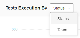
The chart title changes to Test Execution by followed by a drop-down menu that contains two options, Status and Teams.

Choosing Status from the drop-down menu shows the data collected for the selected teams in the same manner as that for the account - the chart shows the total number of test scenarios executed by the selected teams broken down by test result status, Passed, Failed, Unresolved.

Choosing Team from the drop-down menu shows the number of tests executed by each team within the selected time frame.

Defined tests over time
A Line chart that shows the cumulative number of tests defined for each interval for the set period of time.

Detected issues over time
A Line chart that shows the number of bugs or issues reported by the selected teams or for the entire account, within each interval displayed for the chosen Date Range. A separate line is shown for the data collected on each team.

Number of executed tests by...
- Assignee
- Browser
- Device
- OS
- Viewport

The y-axis distinguishes between the parameter variations that the statistic takes into account. The x-axis shows the number of test scenarios executed.
Test results status
The Test Results Status is a Pie chart that shows the pass rate for all the tests that were executed for a set period of time. The pass rate represents the ratio of the number of tests that passed as compared to the number of tests that did not pass, expressed as a percentage.

Top
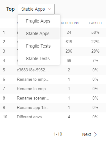
The Top chart ranks Apps or Tests based on how fragile or stable they are and uses the percentage of executions that passed as the measure of Stability. The higher the percentage of Tests or Apps that pass, the higher the Stability. Conversely, the lower the percentage of Tests or Apps that pass, the more Fragile they are.

Use the Top drop-down menu to select whether to show data on Apps or Tests and whether to rank the output in the chart based on how Fragile of Stable they are.
- Fragile Apps
- Stable Apps
- Fragile Tests
- Stable Tests